Are you ready for Google’s ‘Mobile-friendly’ Update?

Google first announced algorithm changes to affect mobile SEO back in November 2014. They have since provided a few more specifics and have revealed via a blog post that the algorithm update will happen on the 21st April, and will focus on ‘mobile-friendliness’ as a ranking factor.
Zineb Ait Bahajji, from Google’s Webmaster Tools Team has said that the upcoming mobile-friendly ranking algorithm changes will have more of an impact on Google’s search results than the Google Panda or Google Penguin update did!
Essentially, what Google is saying is that if your site is not mobile-friendly, you need to take the necessary steps to ensure it is. If 50% of your traffic from is from mobile devices such as smartphones and tablets, if your site is not mobile-friendly (‘responsive’) that potentially your traffic from mobile is at risk.
Why is Google implementing these changes?
Google currently considers that the user experience of many sites featured in their search results is not good enough for the increasing number of people now using Google on their mobile devices. They don’t want to be serving their users with sub-standard search results and so they are making efforts to sort out this problem.
What you need to do
Google have recently provided quite a bit of information for website owners about the performance of their mobile websites and alerting them of any potential issues they may have. Even if your site is responsive and you think it’s mobile-ready, it’s important to have a closer look and do a proper mobile SEO audit. Here are a few things you need to check and action as soon as possible to ensure you’re not left behind –
Run the Mobile Friendly Test
Check out the mobile diagnostic tool available on the Google Developers website. Begin by testing your home page and then each of the main page templates on your website. Make sure the site resources such as images, CSS, JS are also crawlable.
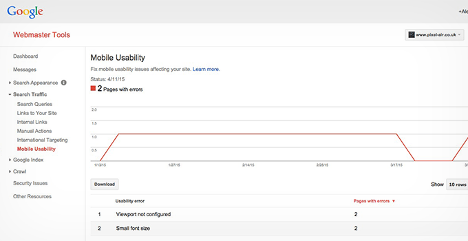
Analyse your mobile usability report
If you have a look within Google Webmaster Tools, Google now details webpages on your website with errors for mobile users – for instance when touch elements such as buttons or links are too close to one another making tapping them with your finger difficult. Other issues are the use of flash or improperly sized content such as huge images that are being scaled down inappropriately.
See if you have a mobile-friendly snippet
Google have started to display mobile-friendly websites in mobile search results next to the meta description in their search results. If your site is missing these ‘Mobile-Friendly’ labels you are likely to have a problem come the 21st of April.

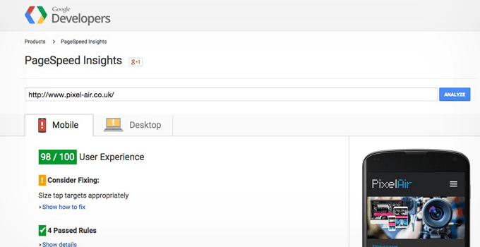
Check your Site Speed
Site speed is another important factor – as you’ll want your site loading as quick as possible via a 3G mobile connection. This is already an important ranking factor for both mobile and desktop sites so use Google’s PageSpeed Insights tool to check for page speed issues on your mobile site.
Each of these online tools will give you a clear indication on whether your site mobile-friendly or not and what you need to do get there. The chances are that many website owners won’t know that they need to actually improve their site to adhere to Google’s algorithm change until it’s too late – don’t let that be you.